Adobe CS3… Creepy Clown Second Thoughts?
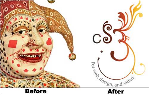
I recently received the CS3 e-newsletter and was happy to see that the exceedingly creepy clown they’ve been terrorizing us with had been replaced by the pictogram CS3 logo. Honestly, I don’t have one of those clown-o-phobias but tell me this thing isn’t a freak of graphic design…


Yeeeeah, that’s a pretty creepy clown. His teeth really bother me.
A prime example of the adage, “Just because you can do something, doesn’t mean you should do something.”
scottopic is my freak of graphic design!