Two Handy Mnemonics for CSS
“A mnemonic device is a mind memory and/or learning aid. Commonly, mnemonics are verbal—such as a very short poem or a special word used to help a person remember something—but may be visual, kinesthetic or auditory. Mnemonics rely on associations between easy-to-remember constructs which can be related back to the data that is to be remembered. This is based on the principle that the human mind much more easily remembers spatial, personal, surprising, sexual or humorous or otherwise meaningful information than arbitrary sequences.” — Wikipedia
CSS is pretty intuitive from the get go, but there are some parts that occasionally get mixed up, particularly if you don’t come from a pre-existing technical background and think like a (formatting) language designer. Two such cases are the “box model” used by CSS to define the various parts of the CSS block elements and the related margin/padding shorthand statement.
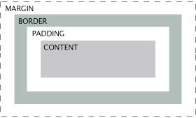
The Box Model outlines how Borders, Margins and Padding are situated around content. It is frequently misunderstood and its elements applied incorrectly. In fact, even developers of Internet Explorer got elements of it wrong back in the early days of Internet Explorer 6.
Essentially, the Box Model SHOULD appear like the image on the left, so I use the phrase “Mac Book Pro” to remember the the order of the various elements around the content. If you really, really dislike Apple products, you could still use it and add “brand rage” to the motivation for remembering this particular mnemonic. 🙂
Margin & Padding Shorthand
One handy feature of CSS is the option to write many of the longer specifications in convenient shorthand. When you’re dealing with multiple stylesheets, each potentially quite long, you’ll come to appreciate this feature.
 Margin and Padding can be defined individually like so:
- margin-top: 10px;
- margin-right: 5px;
- margin-bottom: 20px;
- maring-left: 10px;
but if they all share similar values, it’s often much more convenient to shorten them into a single line, like so:
- margin: 10px 5px 20px 10px;
however this can be problematic if you aren’t certain of the order of those shorthand elements in relation to their longhand (?) versions. I remember the order by thinking of margin & padding elements like a clock. You start at 12 o’clock at the top and simply go around the block/clock in order.


For remembering the CSS Box Model order and properties I came up with “Mothers bake perfect cookies” – Margin, Border, Padding, Content.
Your clock idea is great btw. I think of it similarly, which always helps.